
quip Achievement Badges
UI/UX and Illustration
The quip app’s new achievement badge system to increase in-app engagement by incentivizing users to maintain healthy brushing habits.
My role: UI/UX Design, Illustration
Collaborators: Digital Product Designer, Digital Product Director, Mobile Engineering Manager, Motion Designer, Copywriter
The Challenge
As part of the App for All initiative, the business wanted to bolster app engagement and drive customer retention to increase monthly active users. Surveys among quip customers showed that both current and non-app users indicated a strong motivator for using the app was rewards for brushing. While customers were already able to redeem their points for various tangible rewards, such as Target gift cards and quip products, it takes weeks or months to earn enough points for these rewards. In order to reward users more frequently and improve the feedback loop, the business launched an achievement badge system.
Competitive Analysis
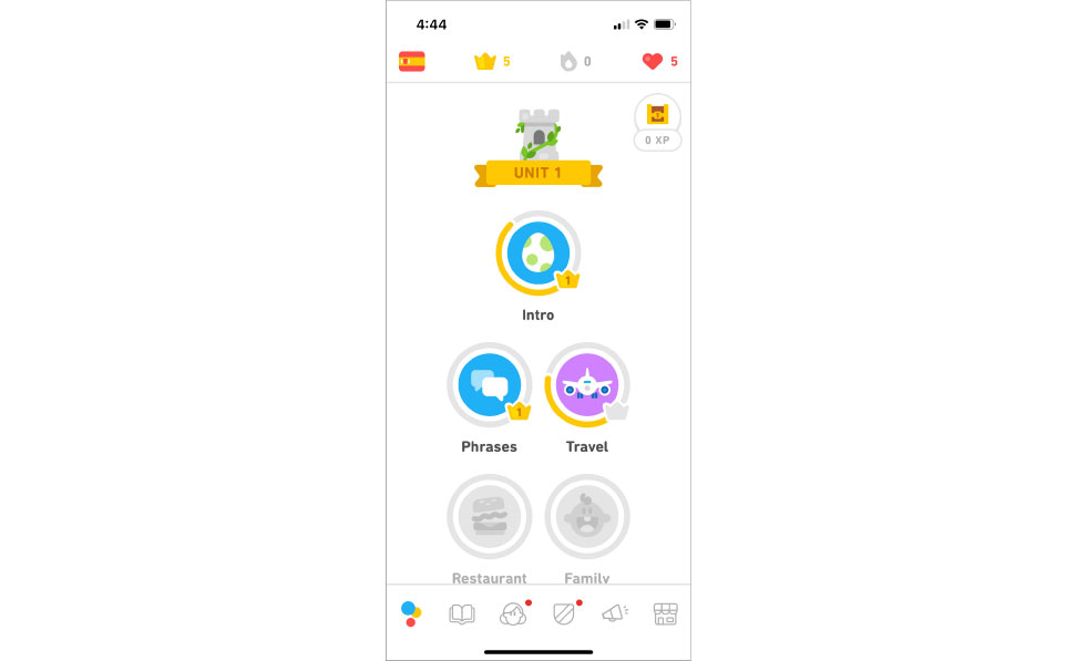
In preparation for building out this new system, we researched achievement badge systems with other health-tracking or habit-building apps. We looked at how progress was indicated, how incomplete and complete states were shown, and visual systems among other achievement badge collections. Two notable examples were Fitbit and Duolingo.
![Duolingo Badges]()
![Duolingo Detail Modal]() Duolingo’s badges prominently featured progress toward each badge through a circular progress tracker and crown icon with the level number. When clicked, the in-progress badge would animate and a detail modal would feature additional progress details with links to tips and next exercise. Badges that had not been started yet were grayed out with no progress indicator.
Duolingo’s badges prominently featured progress toward each badge through a circular progress tracker and crown icon with the level number. When clicked, the in-progress badge would animate and a detail modal would feature additional progress details with links to tips and next exercise. Badges that had not been started yet were grayed out with no progress indicator.
![Fitbit Badges]()
Fitbit’s badges featured different families for steps, climb, lifetime steps and lifetime climbs with unique visual treatment for each family. Given the long-term goal for quip’s achievement badge system to be expandable in order to include flossing and other oral health-tracking, this badge visual system served as helpful inspiration.


Fitbit’s badges featured different families for steps, climb, lifetime steps and lifetime climbs with unique visual treatment for each family. Given the long-term goal for quip’s achievement badge system to be expandable in order to include flossing and other oral health-tracking, this badge visual system served as helpful inspiration.
Design Process
Complete vs Incomplete
Based on competitive analysis and exploration, we concluded having a gray incomplete state and a multi-color complete state (which we saw in Duolingo’s badge system) would provide visual distinction between the two as well as further motivation for users to complete each badge. Additionally, we determined Duolingo’s badge animation in the detail view successfully added another layer of visual motivation for users.
![Incomplete]()
![Complete]()
![Detail view]()
Progress Tracker
To further bolster the feedback loop, we incorporated a circular progress tracker so users could see their progress updated toward each badge. When a badge was achieved, a checkmark icon at the corner of the badge would clearly signify completion for users.
![]()
![]()
![]()
Badge family system
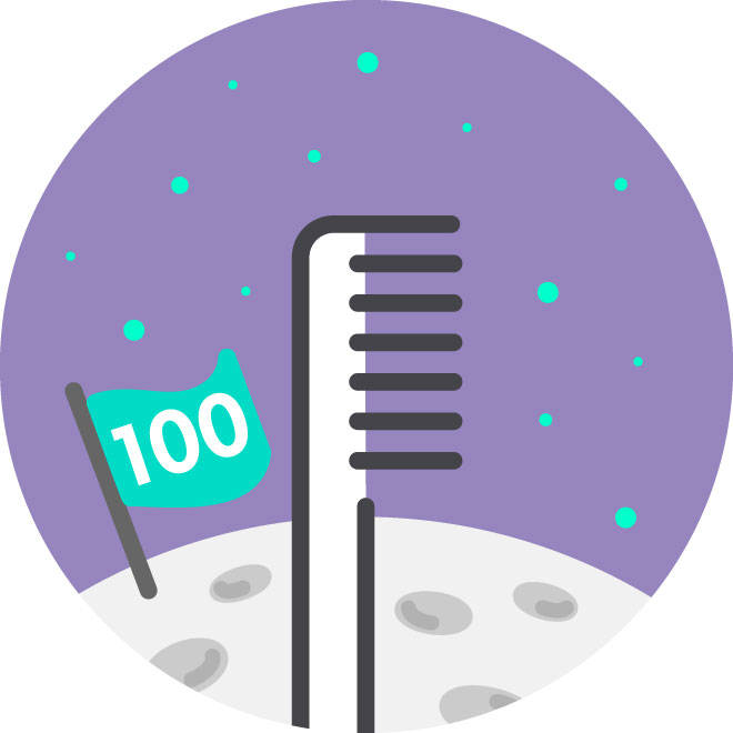
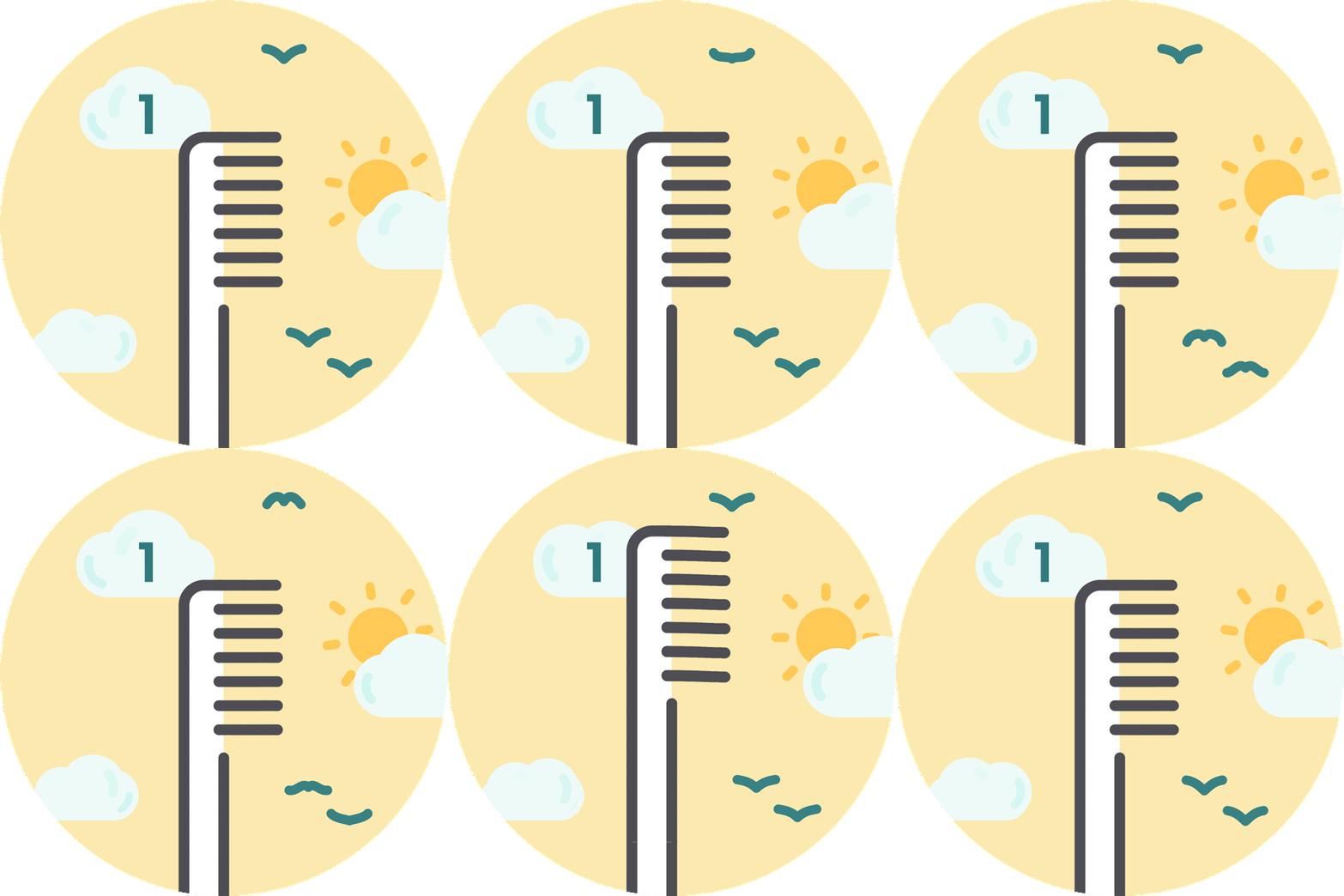
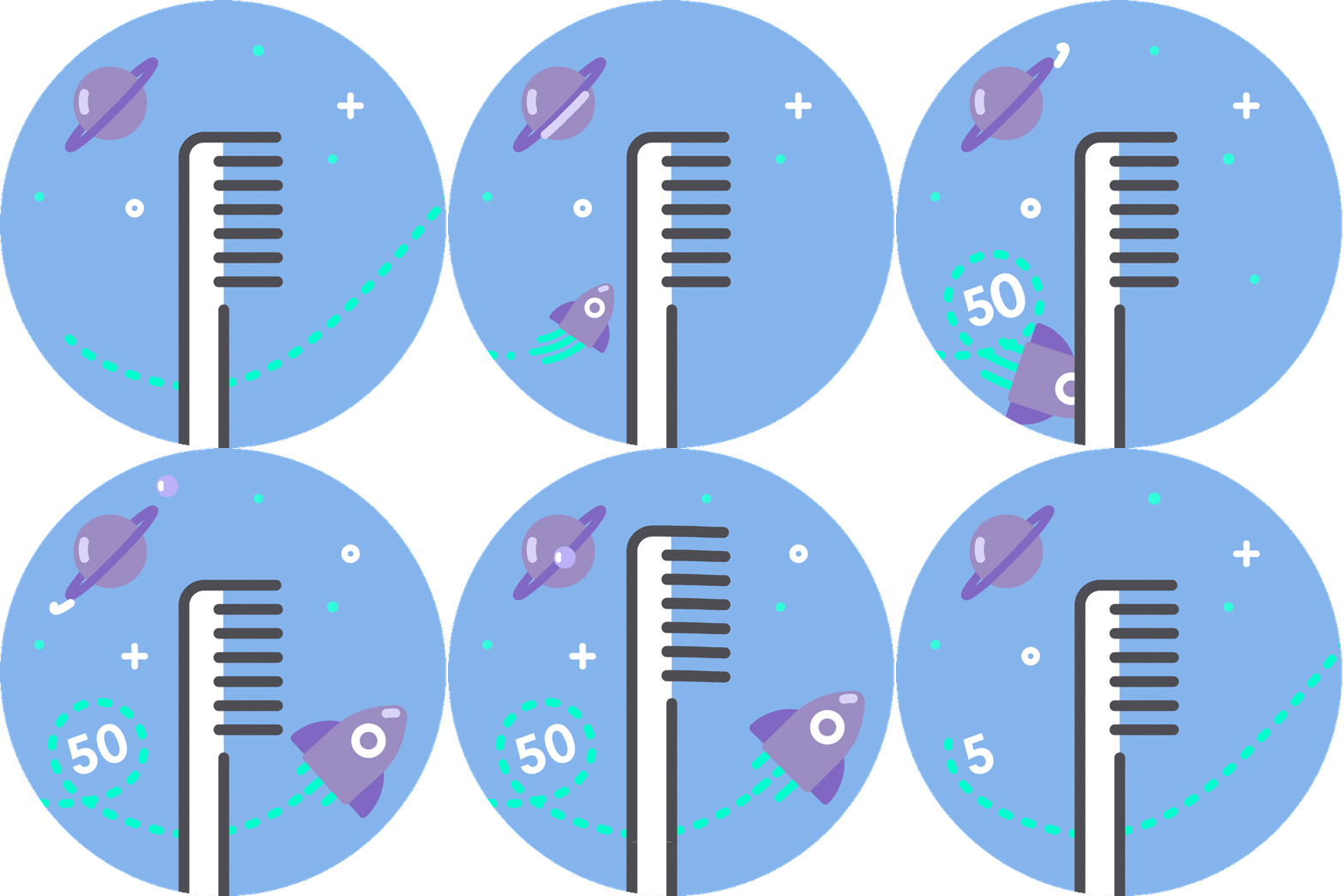
The achievement badges needed to be expandable to allow for future badge families for flossing and other oral health habits. Using Fitbit’s badge visual systems as inspiration, I used our signature brush illustration as the centerpiece for the brushing badges, with the intention of using other product illustrations for future badge families. While the brush illustration is constant, each badge background illustration is different, indicating higher achievements with the higher the elevation, from sky to space to another planet.
![]()
![]()
![]()
![]()
![]()
![]()
![]()
![]()
![]()
![]()
![]()
Previous explorations
In a previous iteration of the badge system, I used only quip-branded colors which are all greens to keep in-line with the established brand guidelines. However, given the delightful nature of this project and the business need to create a new experience for users, I created a new color system that suited the badges and worked with the brand design team to ensure alignment with the existing brand visual system.
![]()
The user journey
Based on research showing that current and potential users deemed rewards as a main motivator in using the quip app, the business determined high visibility of achievement badges would strongly contribute to their goal of increasing app engagement. As such, the achievement badges are featured on the homepage of the app. The homepage features an in-progress badge, an incomplete badge, and a recently achieved badge. The flow is simple from the homepage, with a summary page of all achievements and then badge detail pages of each achievement.
![]()
Based on competitive analysis and exploration, we concluded having a gray incomplete state and a multi-color complete state (which we saw in Duolingo’s badge system) would provide visual distinction between the two as well as further motivation for users to complete each badge. Additionally, we determined Duolingo’s badge animation in the detail view successfully added another layer of visual motivation for users.


Progress Tracker
To further bolster the feedback loop, we incorporated a circular progress tracker so users could see their progress updated toward each badge. When a badge was achieved, a checkmark icon at the corner of the badge would clearly signify completion for users.


Badge family system
The achievement badges needed to be expandable to allow for future badge families for flossing and other oral health habits. Using Fitbit’s badge visual systems as inspiration, I used our signature brush illustration as the centerpiece for the brushing badges, with the intention of using other product illustrations for future badge families. While the brush illustration is constant, each badge background illustration is different, indicating higher achievements with the higher the elevation, from sky to space to another planet.




Previous explorations
In a previous iteration of the badge system, I used only quip-branded colors which are all greens to keep in-line with the established brand guidelines. However, given the delightful nature of this project and the business need to create a new experience for users, I created a new color system that suited the badges and worked with the brand design team to ensure alignment with the existing brand visual system.

The user journey
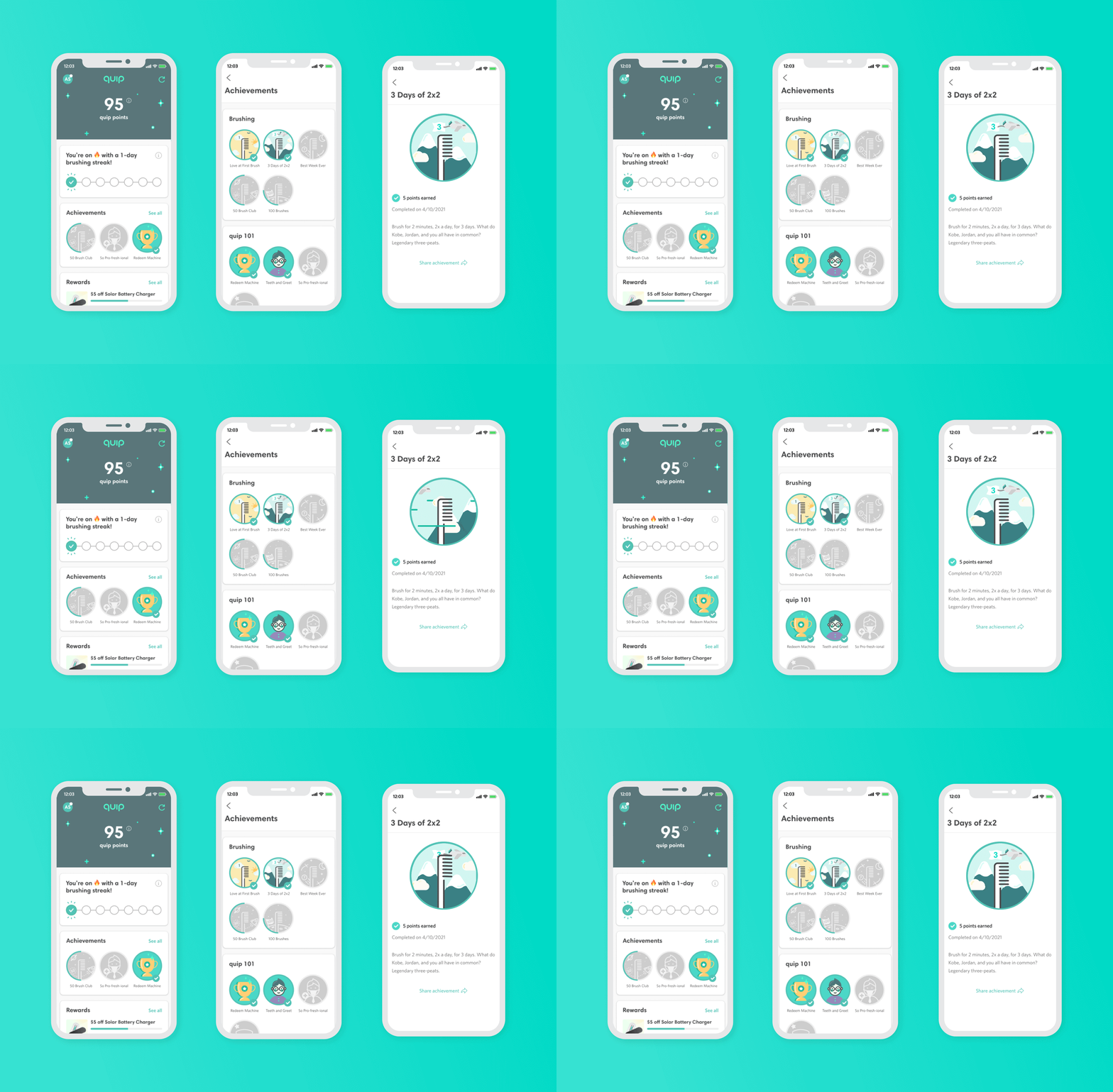
Based on research showing that current and potential users deemed rewards as a main motivator in using the quip app, the business determined high visibility of achievement badges would strongly contribute to their goal of increasing app engagement. As such, the achievement badges are featured on the homepage of the app. The homepage features an in-progress badge, an incomplete badge, and a recently achieved badge. The flow is simple from the homepage, with a summary page of all achievements and then badge detail pages of each achievement.
Implementation
Modifications
In order to prioritize the key functions and deliver an MVP in a timely manner, we simplified the initial design in alignment with engineering and business ops by showing completed badges in the multicolor state with a check mark to signal achievement completion. We are planning to incorporate the circular progress tracker in the next iteration of the achievement badges.
![]()
![]()
The next iteration of the achievement badges will include an in-app message whenever a user completes an achievement, circular progress tracker and any modifications based on research.
In order to prioritize the key functions and deliver an MVP in a timely manner, we simplified the initial design in alignment with engineering and business ops by showing completed badges in the multicolor state with a check mark to signal achievement completion. We are planning to incorporate the circular progress tracker in the next iteration of the achievement badges.

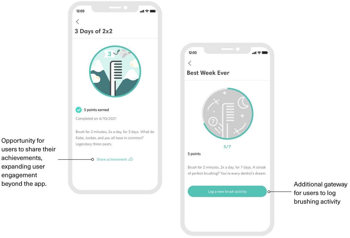
The next iteration of the achievement badges will include an in-app message whenever a user completes an achievement, circular progress tracker and any modifications based on research.
Next Steps
Achievement badge rollout is in progress. The Digital Product and Business Ops teams are monitoring engagement with the achievement badges, reward redemptions and how it may contribute to overall app engagement. Qualitative research among current users is currently being scoped to gather more information on how users enjoy the achievement badges.